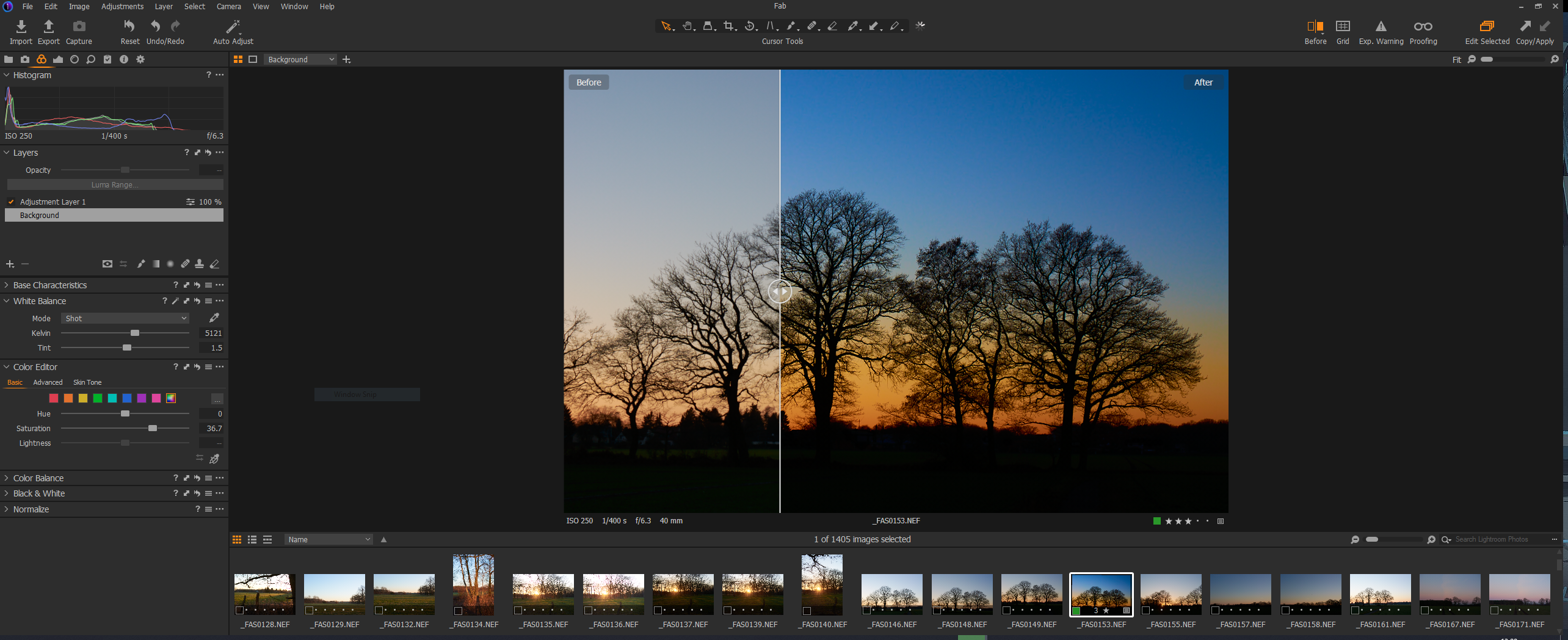
Evaluating Capture One

When I started working as a freelancer at the beginning of 2019, I got an Adobe Creative Cloud Photography subscription to use Photoshop and Lightroom for my journalistic work. I can do pretty much all my graphics work with GIMP, so I really got this subscription to use Lightroom. The fact that I’m paying monthly for apps that I actually only use every other week really irked me from the start. Call me old-fashioned, but I prefer to buy software once and be done with it. I already have too many subscriptions going for streaming services and the like.
Once in a while I try Darktable, but again and again it has struck me as just a mediocre knock-off of Lightroom. It doesn’t have enough of its own ideas and it doesn’t improve on what Lightroom does wrong. So now I’m trying Capture One, which has some nice interface ideas of its own and which you don’t have to rent if you don’t want to. You can just buy it. And – I love this idea – it’s significantly cheaper if you only use cameras from one manufacturer. Since I’ve used Nikon cameras since my parents bought me my F60 back in the day and I’m not looking to switch, I can save quite a lot of money here.
So far, Capture One seems to do exactly what I need and I find the interface a lot more to my liking than Lightroom’s. Especially since you can customise it quite a lot, which is always a big bonus in my book. I’ll be testing this software for the next month, but so far it’s looking like I found my replacement for Adobe’s stupid rental crap.
